Case Study
From chaos to component library
Building UniHomes' first design system
When I joined UniHomes, the product had been built fast, which is exactly what an early-stage PropTech business should do. But by the time I arrived, that speed had accumulated into something that was slowing everyone down.
Designers had made inconsistent decisions because there were no shared constraints. Engineers were rebuilding the same components repeatedly because there was no single source of truth. Handover between design and development was a running negotiation. Every new feature carried the weight of everything that had been built inconsistently before it.
What started as a UI cleanup became a foundational project: building UniHomes' first bespoke design system from the ground up.
Senior Product Designer
Q3 2025
Product Design

The Audit
Before I could propose a solution, I needed to document the problem in terms the business could understand.
I ran a full audit of the existing design files and live product, cataloguing every inconsistency I could find.
The results were stark:
The back-and-forth between design and engineering wasn't a people problem, it was an infrastructure problem.
Developers were making visual decisions they shouldn't have had to make, because the design files didn't answer the questions that naturally arose during build. Every sprint carried hidden overhead.
The Strategy
The temptation with a design system project is to treat it as a design deliverable. I wanted to avoid that.
A system that lives only in Figma isn't a system, it's a file.
I worked with engineering leads and product leadership to agree on three goals:
Unify
Create a single source of truth for all components, one place where both design and engineering could find a definitive answer. This meant the system needed to live somewhere accessible to the whole team, not just designers.
Accelerate
Eliminate the question-and-answer overhead in handover. If a developer had to ask me what a button looked like in its disabled state, that was a system failure. The goal was zero ambiguity at the point of build.
Scale
UniHomes was growing. The system needed to support multiple surfaces and, eventually, multiple brands under the same product umbrella. It had to be built to evolve, with contribution pathways, deprecation rules, and a versioning approach, not just built to cover what existed today.
The Build
Stage 1 - Foundations
I started with colour, typography, and interactive primitives (buttons, links, states). These aren't just aesthetic choices, they're the decisions that cascade into everything else. The border radius on a button will inform how input fields feel. The type scale determines how information hierarchies work across every layout. Getting these right first meant every subsequent component was building on solid ground.
The most contested decision at this stage was colour. The product had accumulated 12 variations of its core orange, some intentional, most not.
I reduced these to a structured palette of five tonal values (primary, secondary, hover, disabled, destructive) with explicit guidance on when to use each.

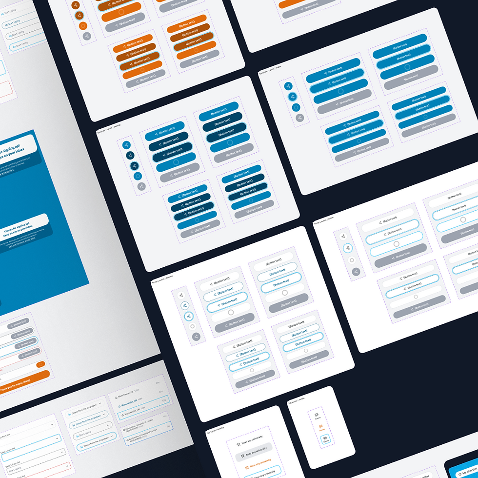
Stage 2 - Common components
With foundations locked, I built outward: form inputs, navigation patterns, gallery layouts, header and footer structures. The principle at this stage was coverage before perfection, getting the components that appeared on the majority of pages into the system quickly, so engineers could start using them and surface real-world edge cases before the system was fully released.
Each component was documented with:
-
States - default, hover, active, disabled, error, and empty states.
-
Responsive behaviour at three breakpoints.
-
Accessibility notes.
-
Usage guidance covering both correct application and explicit anti-patterns. The anti-patterns section turned out to be the most-referenced part of the documentation in early adoption.

Stage 3 - Adoption and maintenance
Shipping a design system is the easy part. Getting a team to actually use it (and keep it updated) is where most systems quietly die. I treated adoption as a design problem in its own right.
I introduced a system of annotations in Figma handover files for edge cases and animated interactions. These removed the most common source of interpretation variance: the things that look straightforward in a static file but require explicit intent to build correctly.
I also started attending engineering refinement and sprint planning sessions; not to govern, but to observe. Watching the handover process in action showed me exactly where the system was creating clarity and where it was still leaving questions open. I treated those sessions as live research.
Retrospectives became a regular feedback channel.
Engineers would flag components that had needed workarounds, or pages where parity between the Figma file and the live product had drifted. These weren't failures, they were the system working as a living thing rather than a finished artefact.

Results
Significantly reduced
Design meeting length
100%
New screens using the system
High and improving
Component parity
Eliminated
Component duplication
The metric I'm most proud of isn't in that table. It's the shift in the nature of the conversations between design and engineering.
We stopped talking about what things should look like and started talking about why we were building them. That's what a design system is supposed to do, it removes the low-level decisions so the team can spend their energy on the ones that actually matter.
Reflection
What I'd do differently
I'd involve engineering earlier in the foundation decisions, specifically the colour and typography choices. I made those calls largely as a designer and socialised them afterwards. In retrospect, getting an engineering lead in the room during that stage would have surfaced token naming conventions and implementation considerations earlier, and would have given the system stronger cross-functional ownership from day one.
What I'd add with more time
A contribution model. The system I built was primarily designer-maintained, with engineering consuming it. A mature system needs a pathway for engineers to propose and contribute components, particularly for patterns that emerge in development that weren't anticipated at design stage. That's the next evolution.
What this project taught me
Design debt and technical debt are the same problem viewed from different seats. The cost of inconsistency isn't visible until a team tries to move fast , then it becomes the most expensive thing in the room. Building the system wasn't really a design project. It was an organisational one.